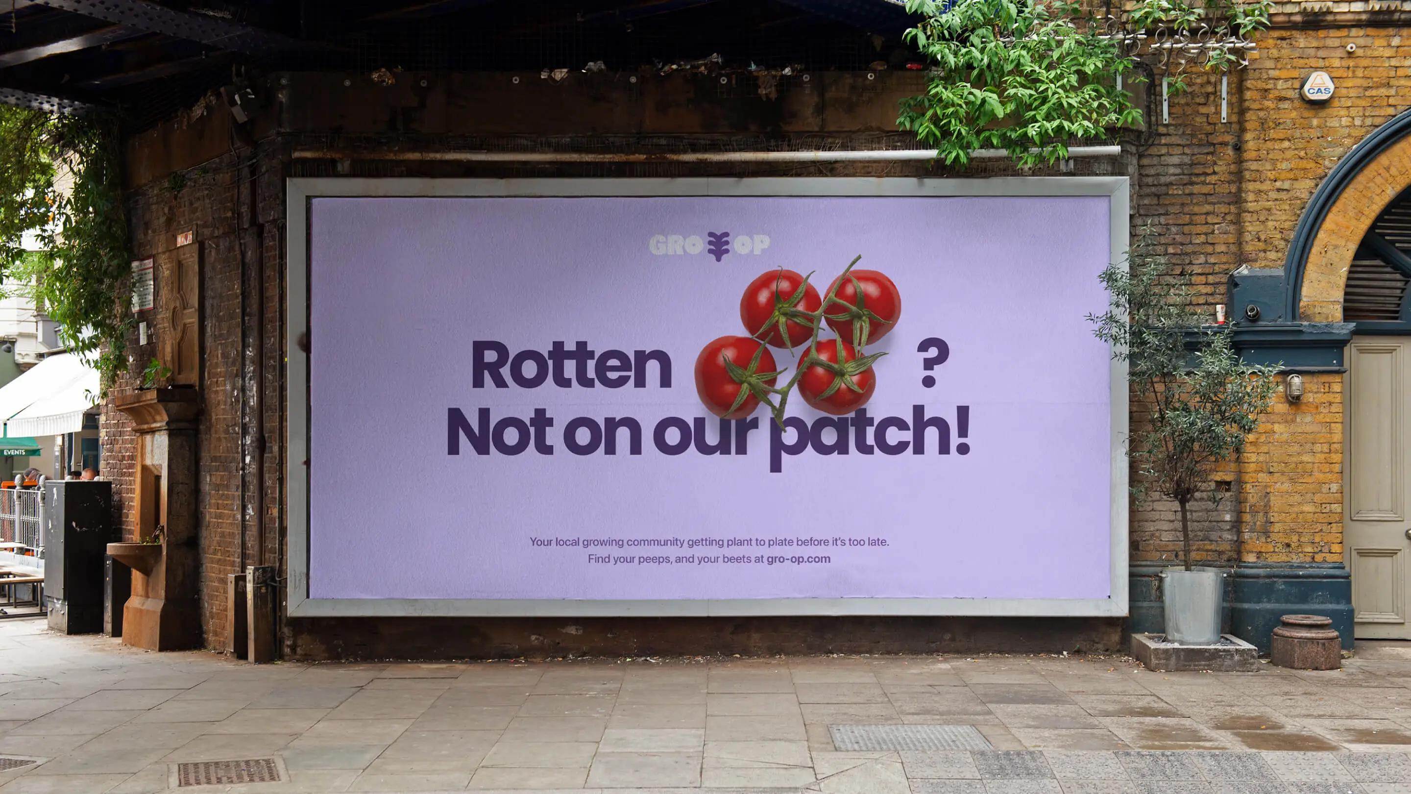
This July, Driftime’s GRO-OP cooperative concept has been featured on Creative Boom, a well-respected industry title spotlighting the very best in design and innovation.
Creativity and design go way beyond making something beautiful; problem-solving is ingrained in the nature of designers, who have a huge part to play in driving the world towards a greener, more socially balanced future.
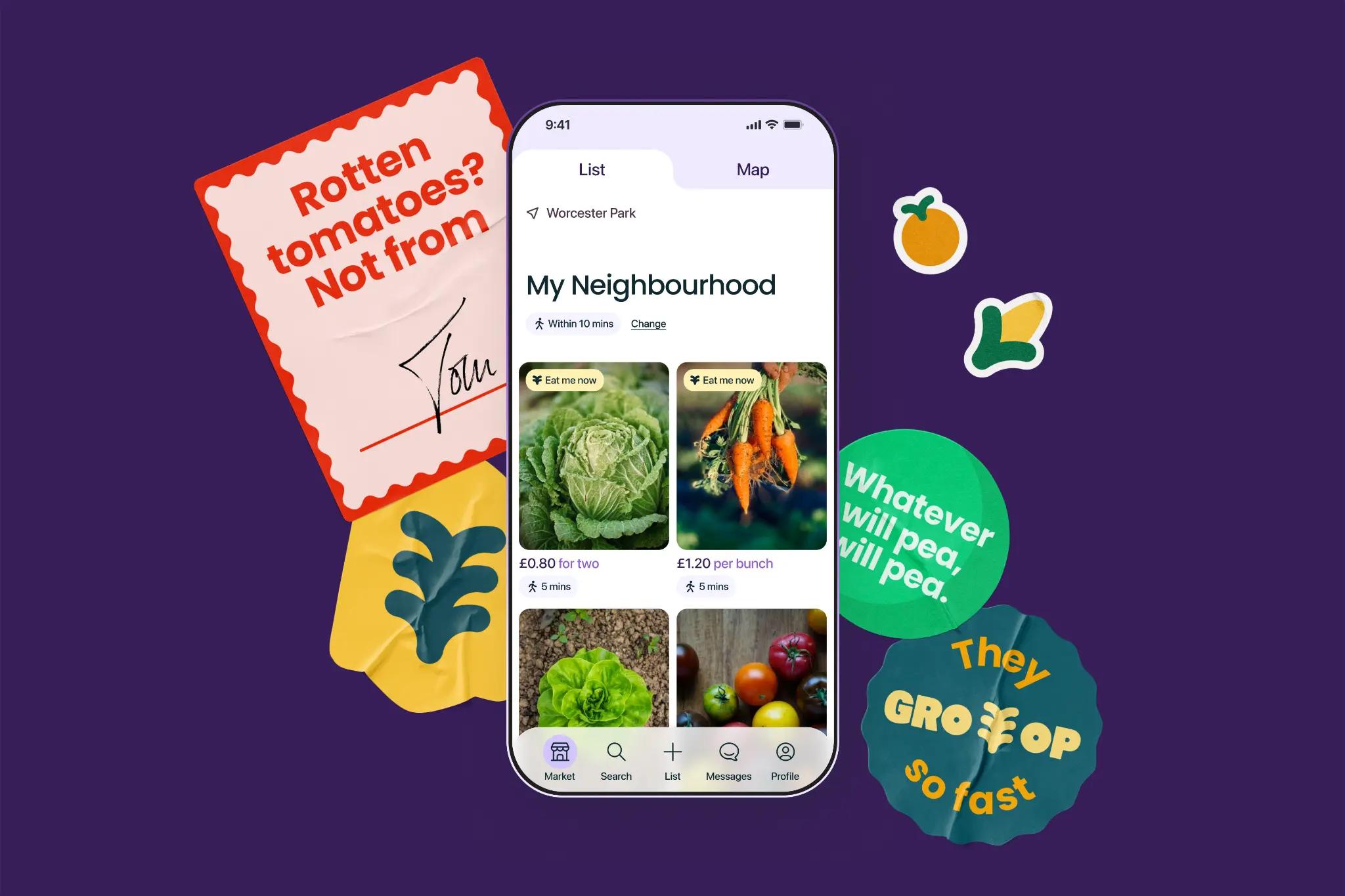
Brand and digital design studio Driftime rose to the challenge on this particular issue and designed the GRO-OP concept, a digital platform that connects local growers and grazers. Through GRO-OP, people growing the produce can offer their extra potatoes, peas, pears and more to people looking for fresh produce at an affordable price.
GRO-OP was born from Driftime's Hackathon, a collaborative and intensive experiment that tests what the team can achieve with creativity in an all-hands four-day sprint. "We worked hard to build a digital solution to a real-world problem that has sturdy legs and a viable business model, resulting in GRO-OP, your go-to community cooperative", says Driftime CCO and co-founder Abb-d Taiyo.

Transparency and usability
Driftime's approach to the UX/UI design of GRO-OP was to implement "invisible design", aligning with the idea that the platform should get a lot done without asking too much from the growers or grazers. "By employing AI in the produce identification process, we stripped back the often lengthy and extensive task of listing an offering into what feels like an intuitive and familiar Google search, assisted by AI rather than led by it", says Taiyo.
Transparency was also important to the design team, meaning the design had to be accessible and usable for all demographics with zero learning curve, without it looking too overdone or conventional. He explains how the UX/UI "playfully nudges recipients into sustainable behaviours", making subtle suggestions such as walking to pick up produce rather than using fuel by indicating the walking time on a map. "Seasonal Suggestions" are also tactfully placed throughout the app to promote seasonal growing and grazing, keeping humans in sync with the planet.
"Problem-solving is ingrained in the nature of designers..."
Creative BoomGoing against the grain
Cues from the natural world feature throughout the GRO-OP graphic identity, from the logo's "growing" animation to the typography's organic shape. Driftime designed the identity to be "contemporary and spirited," says Taiyo, complementing the copywriting with approachable fonts and shapes to highlight GRO-OP's "intentionally pun-led and informal language".
Taiyo says: "GRO-OP is designed as a platform that feels more like a cheerful chat around the allotment than a serious marketplace, and we feel like the language, both visual and written, helps to encourage that outlook.
The obvious visual choice for anything planet-related is various hues of green, but Driftime purposely avoided this, instead opting for a deep purple colourway. Taiyo describes it as "more ownable and interesting," adding that it encourages "an alternative visual framework for a fresh local growing cooperative."

People over profit
Solving an offline challenge with a digital solution comes with its own challenges. There was an ambient difficulty when it came to designing a platform that encourages benevolent actions. GRO-OP ultimately asks its growers to prioritise community over business and people over profit. The studio took this into account when designing the flow for how people list produce, ensuring the items are labelled as "free" after a certain number of days as default.
Taiyo adds that the app "explicitly encourages growers to set prices that feel realistic, affordable, and most importantly, fair". Empowering recipients to take positive action of their own volition was another challenge, which he says was solved by using "invisible design to subtly encourage good decision-making that fulfils growers and grazers alike".


