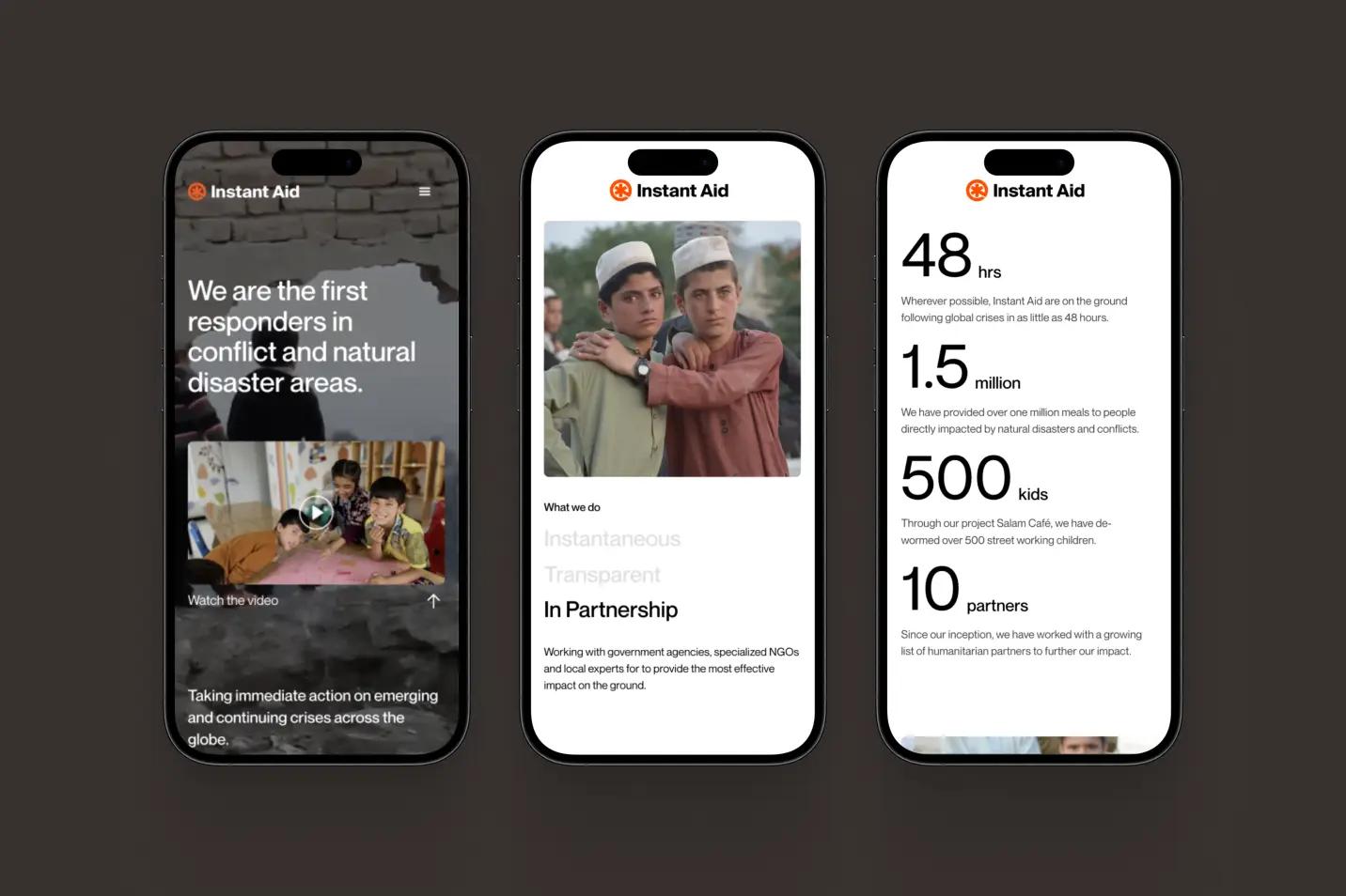
Instant Aid, a disaster relief non-profit operating in conflict zones like Ukraine and Gaza, has partnered with the design and impact agency Driftime® to undergo a major rebranding.
What was the brief for the rebrand?
The primary goal of the redesign brief was to place Instant Aid in a position where they could secure funding, further partnerships, and establish credibility in the field all whilst actioning their vital work on the ground in global disaster zones. Ahead of the full website and branding launch, an interim site was developed by Driftime® which helped to play a crucial role in facilitating conversations and building trust with influential organisations and institutions in the context of global crises, subsequently securing a high-level partnership.

Describe the purpose of the brand and its target audience
Instant Aid are the first responders in conflict and natural disaster areas, taking vital and immediate action on emerging and continuing crises across the globe. With a remarkable impact reaching communities worldwide from Afghanistan to Syria, by way of Gaza, Ukraine, and Pakistan, Instant Aid work in partnership with government agencies, specialised NGOs and local experts to provide the most effective impact on the ground.
With a focus on mobilising immediate, targeted, and localised support to those affected by global disasters within just 48 hours, Instant Aid reaches a wide demographic, calling for support from funders, NGOs, and influential institutions, as well as empowering people on the ground with the resources they need to recover from crises.
By partnering with design and impact agency Driftime®, Instant Aid opted for a comprehensive rebranding initiative, including a new logo, website, and refreshed tone of voice aimed at reinforcing Instant Aid’s reputation as a reliable leader in disaster response. To break away from the traditional bureaucratic image associated with the industry, Instant Aid sought a new visual identity that reflects this commitment.
“We created something ownable and distinct from others working in the field.”
CreativepoolWhat was your thinking behind the rebranding solution?
Driftime® designed the brand in a way that creates a distinction from traditional NGOs and relief organisations that tend to use a light blue in their visual identity and often opt for a crest or wreath in their logo to signify their authority and legacy. Driftime® decided to subvert that idea, instead creating something ownable, recognisable, and, crucially, distinct from others working in the field.
The visual identity features a vibrant orange-red hue to convey urgency, with the new logo reimagining the six-pointed medicinal star, known as the “star of life”, to emphasise the third point that signifies “early response”, the core of Instant Aid’s mission. This design transitioned away from the classic light-blue crest commonly employed by many legacy NGOs, setting Instant Aid apart from the conventional visual presentation of humanitarian aid organisations, instead building an ownable mark and brand identity that will feel increasingly recognisable over time.

Were there any unexpected insights or discoveries about the brand that emerged during the rebranding process?
Trust is hard to come by in these spaces, and so working alongside Instant Aid to understand how we can both earn and keep the trust of recipients and partners felt particularly important.
The landscape of humanitarian aid itself is challenging to get involved with as a newcomer, and whilst Jasmin’s rich heritage of understanding and extensive experience in the field has equipped her with the knowledge and network to action incredible impact, it’s no mean feat. Understanding this approach through the rebrand was an invaluable insight, and helped to inform our approach, process, and delivery.

How did you ensure that the new brand identity resonated with the brand's existing audience while also attracting new ones?
From early on, we found that we’re not creating this brand for anyone in particular, we’re instead creating a brand to help establish a recognisable identity to build trust with both partners and those in crisis.
We want people to see the orange logo of Instant Aid and immediately know that they’re going to be supported by an authentically benevolent organisation that has the interests of those in crisis at heart. There needs to be less emphasis on the brand itself, and more on what the brand represents, and the inspiring impact that Instant Aid has had globally.


